Fading Colors
Fading Colors is a project my team and I developed over the course of 3 weeks (ended on 27.09.2025) during our univeristy study. It is a story game with a PSX style (low poly assets, pixelated textures and pixelated post processing on the camera) centered around a painter afflicted by Alzheimer's. The theme for the project is making a product centered around an association/foundation of our choosing, so my team and I chose Alzheimer's Association. Our game is meant to show the effects this illness has on people and on raising awareness about symptoms and how to help those affected by it.
Over the course of the project, I took the role of art lead and was primarily responsible for the art direction, overlooking the asset proudction, texturing, in order to maintain a coherent look, as well as conceptinig the environment, setting the atmosphere, modeling the props that would occupy the painter's space, as well as creating the paintings the character would be creating during the game.
The game covers 3 days of the painter's life, as well as one day where you play as his daughter and caretaker. Every day, the condition is shown to be getting worse through rearrangement and chaos. For example, in the second day, the furniture in the home gets shuffled in order to confuse and disorient the player, mimicking what someone afflicted with Alzheimer's might feel even in a familiar place like their home. This would get worse, as in the third day the entire layout of the house gets flipped, making for a very surreal/odd experience for the player, as the environment they have come to know has been turned upside down.
The condition is also shown through paintings. I took inspiration from William Utermohlen when creating the paintings. He was an artist who suffered from Alzheimer's and every few years he would create a new self portrait, which ended up being visibly more and more distorted and abstract as his condition worsened. I implemented this into the paintings having a regular version for each, seen by the painter while you're controlling him, as well as a distorted version (which is the real one others see) which can be seen while playing as the daughter in one of the days.
The daughter's job in gameplay is to set reminders through notes on post-its around the house on specific props, so that she can help her father remember their use, otherwise they turn into distorted, undistinguishable models, that look similar to other props.
In the concept art I aimed to capture the feeling someone would get visiting their grandparents' home. I wanted the environment to look cozy and welcoming, as well as filled with vintage props to give it age and familiarity. The warmth of the light helps drive this point forward. I also wanted the place to feel lived in, so a lot of props and pictures on the walls were mandatory in order to get this effect.
When modeling, the aim was to have everything be recognizable despite the low poly count, as the style we were going with would not work with highly detailed models. Textures, therefore, did a lot heavy lifting as well regarding readability. I made as many items to fill up the house as I could, given the time frame and my responsibility of overlooking all the other assets created by my team.
As for the paintings, I tried immersing myself into the character, as I listened to the music my teammates created while painting them, basing the vibe of each one entirely on what I was listening to and on what we knew about the character we wanted to create.
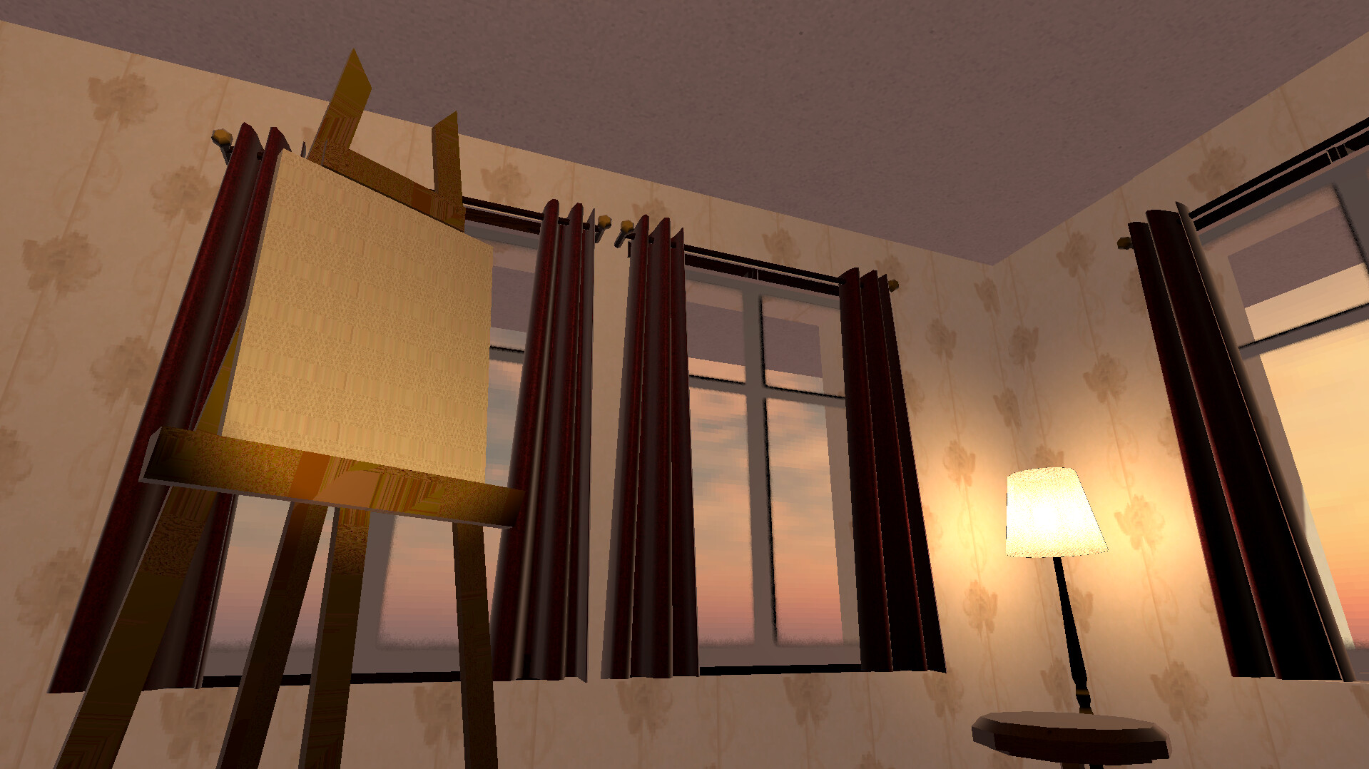
Title screen scene of the game

The sketch for a room in the old painter's home.

The fully rendered room without any light rendering.

Fully realised environmental concept art for the painter's house in the game.

Maya preview of some of the small/less important props I modeled. The aim for the project was to keep everything at a low poly count while still having the props be recognizable.

Maya preview of some of the larger/more important props I modeled. The aim for the project was to keep everything at a low poly count while still having the props be recognizable.
Set of large props I modeled to fill the space in the home.
Set of small props I modeled to fill the space in the home.

First painting and its distorted counterpart. Music played a big part in setting the scene and each day's theme inspired the painting, the first one being upbeat and lively.

Second painting and its distorted counterpart. Music played a big part in setting the scene and each day's theme inspired the painting, the second one being more somber and serene as the painter pictures his wife.

Third and final painting, only visible after the game has been defeated. This is meant to showcase the painter himself losing his sense of reality and memory, everything, including his reflection, becoming pure color.

In game view of the kitchen with all the assets in place.

In game view of the working/painting space with all the assets in place.

In game view of the living room with all the assets in place.

Showcase of the room rearrangement in day 2. By shuffling around the furniture, we aimed to confuse the player and disorient them the same way a person suffering from the illness would be, even in their own home.

Title screen for the game after finishing it, showing the last painting made in the final day.